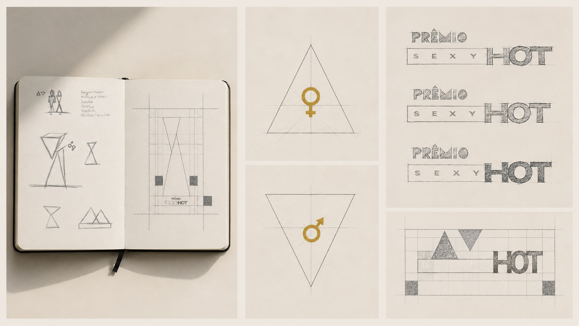
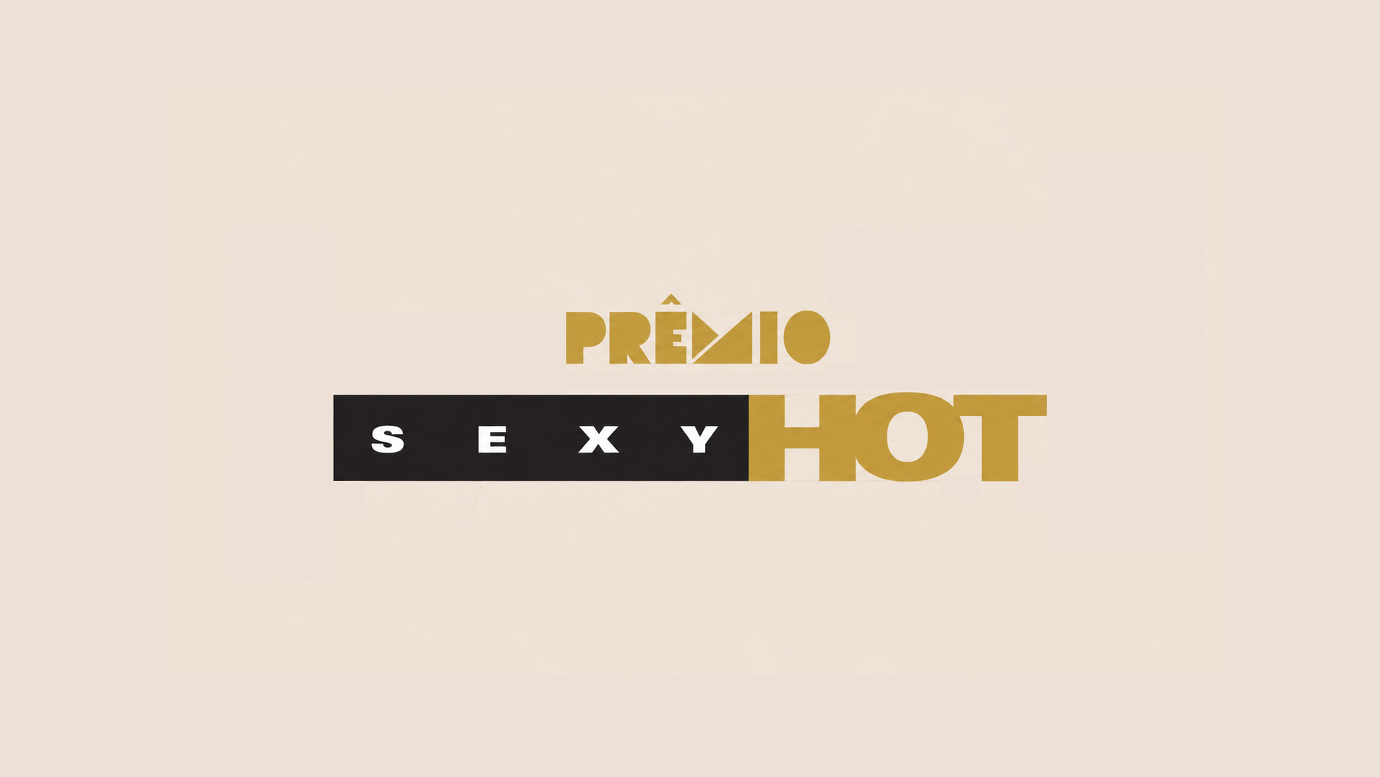

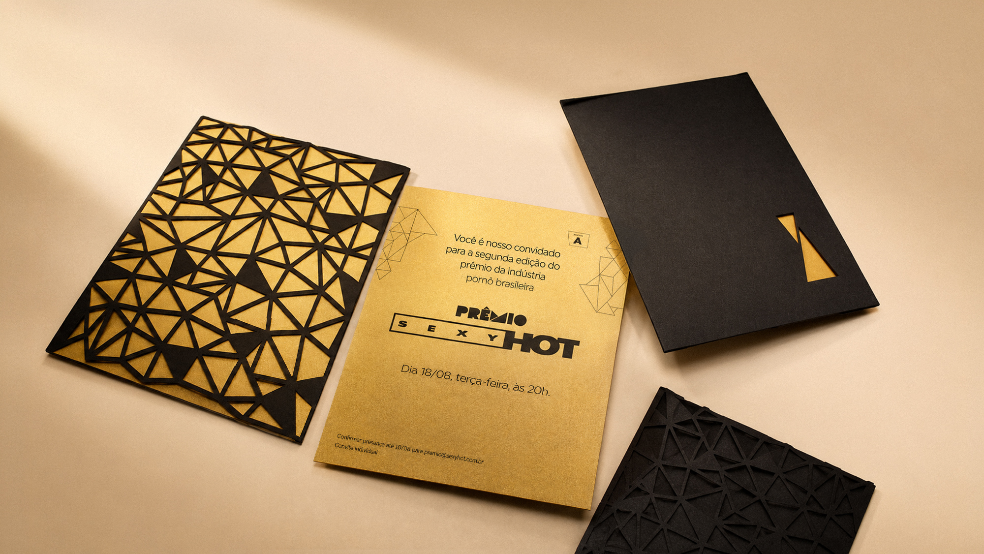


When the Prêmio da Indústria Pornô became Prêmio Sexy Hot in 2015, the challenge was to create an identity capable of talking about sex without resorting to its most obvious representations. The concept began with two elemental forms: two triangles, masculine and feminine, body and symbol, opposites meeting at a single point. From that relationship, the entire identity emerged. Together, the two triangles form an abstract human figure. From that same geometry, I also designed the trophy, not as an object added to the identity afterwards, but as the identity itself transformed into matter. The system expanded into invitations, patterns, graphics and scenography, creating a visual language solid enough to endure, yet open enough to accommodate a different theme for each edition. The narrative around sex changed. The identity remained.
- client
- Playboy do Brasil
- year
- 2015 — 2017
- where
- Buurt
- creative direction
- Tchelo
- copywriting
- Ed Dutra
- design
- Tchelo, Frank Turner, Gustavo Tudesco
- internship
- Elisa Pessôa, Sasha Souza, Mariana Gaspar, Tatiana Moniz
- account
- Bruno Souza
- set design
- VamoQVamo
- production company
- Tourné
- approval
- Mirna Schleder, Luiza Bandeira, Cinthia Fajardo