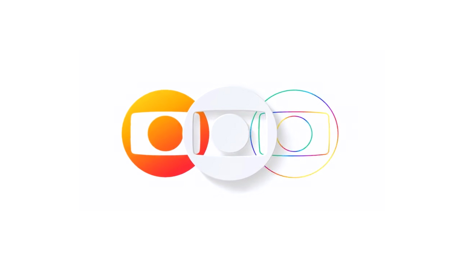
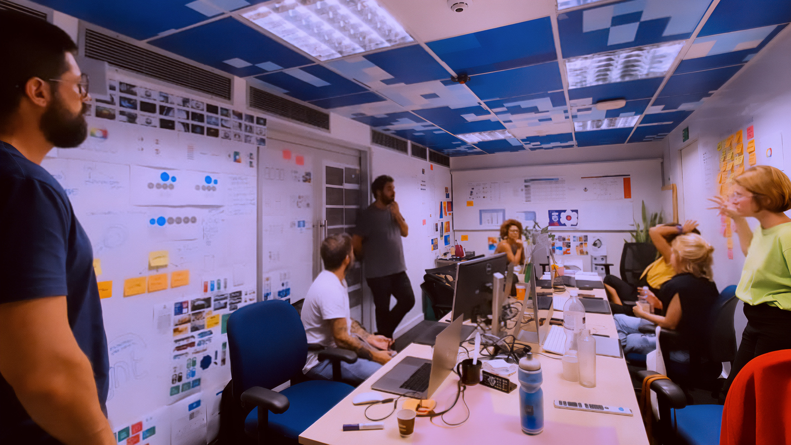
I had the privilege of being part of the squad responsible for developing Globo's new brand, within the integration of the Group's companies and brands started by the Uma Só Globo project. Three months of immersive work, alongside people I deeply admire, in a daily construction made of research, discussion, experimentation, prototyping and testing, in constant exchange with different teams and disciplines.
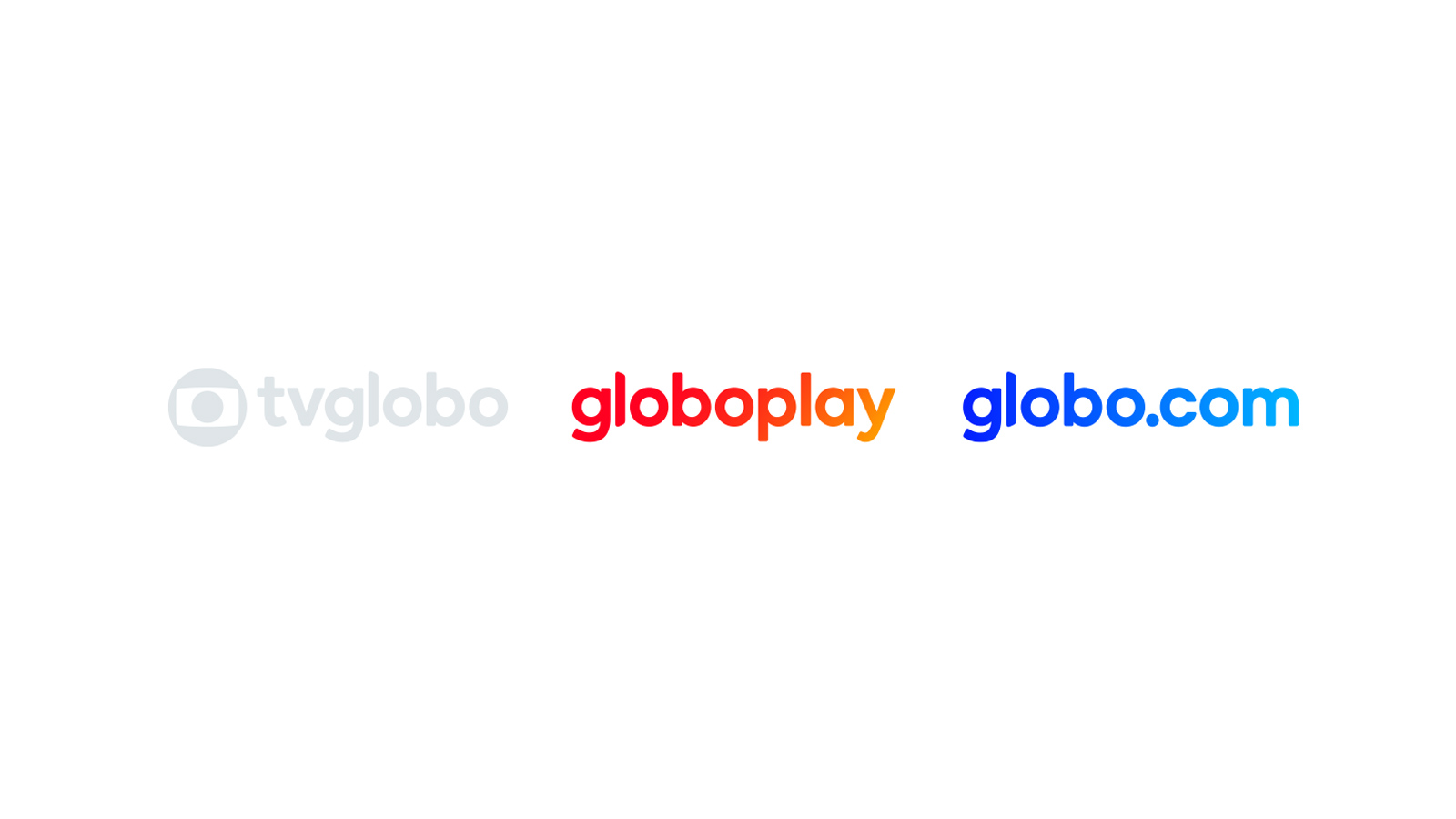
The challenge went beyond creating a new visual expression for Globo. We also worked on its brand architecture: how the Group's different brands, products and businesses could be organised, relate to one another and coexist coherently inside a single ecosystem. From that thinking we developed a system able to scale and unfold across visual communication, environments, architecture and the Group's entire brand portfolio.
The result came out of a deeply collective process, in which different paths were explored, confronted and refined until we reached an identity able to represent a new Globo: more integrated, more coherent and ready to speak as one.
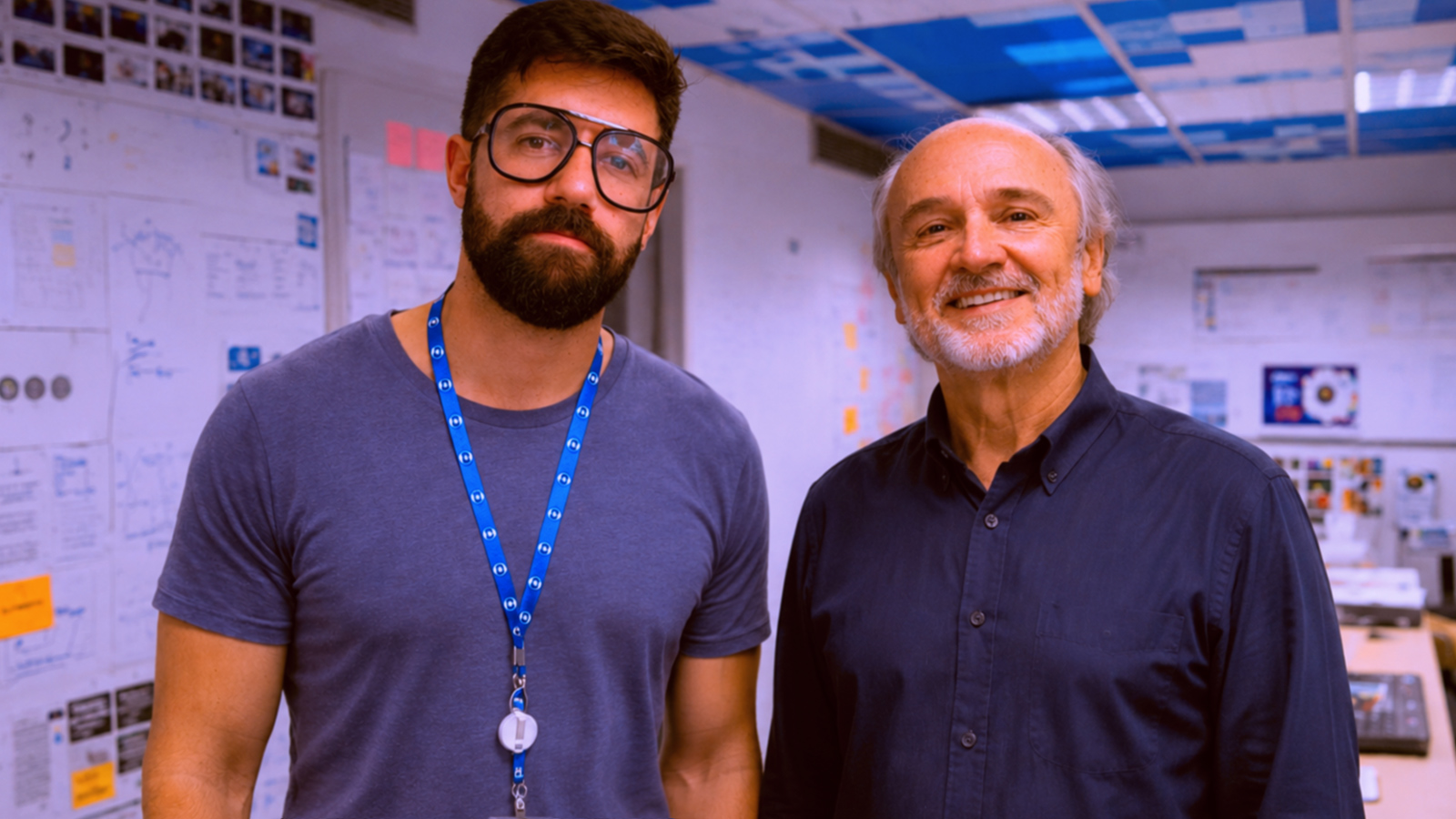
And it was even worth a coffee with the master himself, Hans Donner — the man behind the original Globo identity.
- client
- Globo
- year
- 2020—2021
- brand squad
- Carolina Miranda, Christiano Calvet, Julio Marcello, Lara Miranda, Lorena Freire, Ricardo Moyano, Tchelo
- planning & strategy
- Bernardo Magalhães, Manuel Falcão, Washington Teotônio
- operations
- Didi Lima, Suzana Poli
- creative direction
- Mariana Sá, Sérgio Valente
- typeface design
- Fabio Haag
- motion design
- Beeld